4 years ago
One very important part of working as a Data Scientist is often overlooked. I'm referring to the part which involves visualising data and results. You probably don't think that this is an exciting task, but let me explain why it is so important. Usually, Data Scientists are fascinated by making complicated models and trying out new architectures. However, as the job title suggests, the main part of a Data Scientist's work is to do with data. For example, as a Data Scientist, at the very start of every project, you begin by familiarizing yourself with the datasets on which you will be working. Of course, the easiest way to do this is just to open the files and look at them. In the case of images, it is quite simple to understand the content of the image without using special tools or packages. On the other hand, visualisation is often the best option not only when it comes to gaining your first insights into data, but also when it comes to searching for and identifying the first set of patterns, trends or outliers.
Our brains are fascinating “machines” which can take in a great deal of information from just one picture. It is not without reason that we say that a picture is worth a thousand words. So that is why we need to create high quality visualisations. By high quality I'm not really referring to the choice of colours, but more to how the information is presented. Unfortunately, nearly every day, we see many graphs and plots that have been poorly designed. The problem is not that they look poor from an aesthetic point of view, but that the way in which information is presented is misleading or deceptive (sometimes even on purpose). For example, Reuters published the plot below, and I consider it to be one of the best examples of a misleading plot.

Above, we see a line plot with marked points and, at first sight, the plot looks correct. One of the points in the timeline has a description ("2005 Florida enacted …"), which seems to show that a change was made in the Law and that, as a result, there was a drop in the number of murders. But wait … let’s look carefully at the scale on the y-axis. From what we learned at school (that 0 is at the bottom left hand corner and that larger values are placed progressively higher up the axis), we expect every graph to follow the same rules. However, in this case, the author changed where 0 starts on the axis (to the top rather than at the bottom), which means that it is not immediately obvious how to interpret the plot. The simplest way to fix this is to turn the plot on the x-axis. And after that, you will see that the red colour is no longer the background of the plot, but is really the actual area under the plot. As a result, you will come to conclusions based on the corrected plot that are quite different to any conclusions which you can draw from the original plot.
One type of plot is doomed to failure. You might be surprised to learn that I'm talking about the pie chart, which you know so well from many presentations and the media. Unfortunately, this chart has a fundamental problem with how it is defined. This is because human brains are not good at analysing angles. In a pie chart, we compare angles to say which group is bigger or smaller compared to the 100% data total. Well, we can say that element A has a bigger or smaller representation but, if the question is in the form of “how many times is part A bigger than part B”, then it is impossible to answer that question without listing the actual percentages for A and B. Another problem is that it seems to be impossible to compare two pie charts by just looking at the plots. Here is an example:
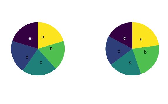
If we want to know the difference between any part on the left plot to the same part on the right plot, then you can only take a guess because you do not know what the numbers are. I hope that you now understand why scientists of all types hate pie charts. John Tukey, who was a statistician, said "There is no data that can be displayed in a pie chart, that cannot be displayed BETTER in some other type of chart". And a 3D pie chart is even worse than a standard pie chart! Maybe the 3D version looks fancier to some people, but such a chart only makes it more difficult for readers to really understand the structure of the data.
The choice of colour palette is another challenge when it comes to data visualisation. This especially applies to a choropleth map, in which different elements are assigned a different colour. For example, you probably remember geography lessons in which you looked at map which showed mountains, lowlands, seas, etc. in different colours. This approach can be helpful, especially when we look at a map and we want to quickly find, for example, mountain ranges.
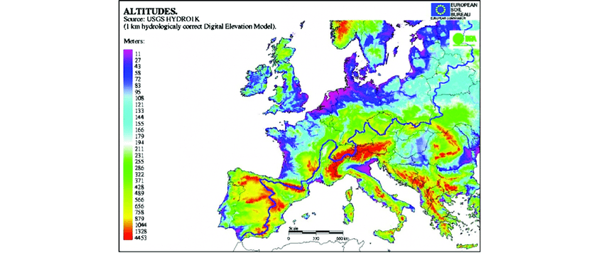
On the other hand, the example above shows how a colour palette can cause confusion in our understanding of data. When you look at the scale on the left side, we see that the minimum value is represented by purple and the maximum value by red. However, if we want to find out which colour represents the mean value in this range, then we cannot figure out the answer to that question. Next, note that some parts of the map are coloured white. Usually white means that a value is 0 or that there is no information for a given area. However that is not the case in this plot, where white colour is assigned to values around 200 metres, and 200 meters is not the mean value in this range. The final problem here is that, if you look at values on the scale, you see that intervals for each colour are about every 20, but the last interval is about 3000. So that’s a big surprise.
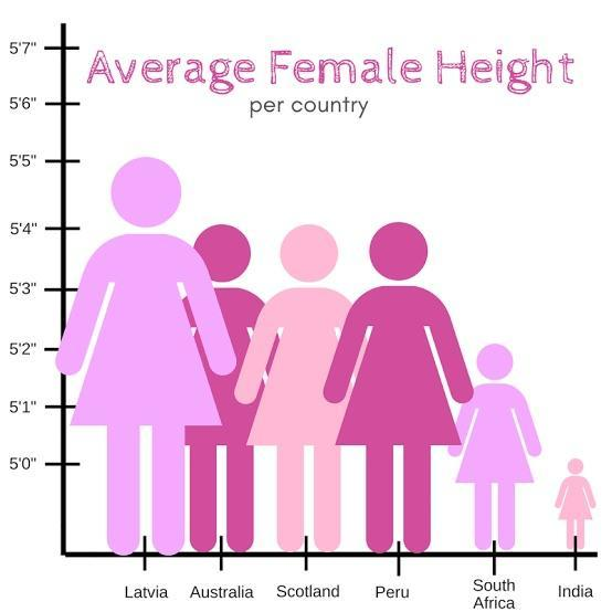
Did you know that, if you want to cheat or hide some “inconvenient” data, bar plots are the best choice for that? Of course, I'm not suggesting that you would want to mislead anyone, but only helping you not to be misled by others. One method of cheating is to create the illusion of a “big difference” by using a scale which does not begin from 0. When we don’t start from zero, we only see the tip of the iceberg with a set starting point which was convenient for the author. A good example of that is the plot below. At first sight, it looks as if women in Latvia are several times taller than their counterparts in India. But this is not true! The real difference is about 5 inches, which is less than 10% of the average height across the data set.
From the examples given above, you can see it is crucial to present data and information in the best way so that it is possible to understand them clearly and correctly. So, when you are at the stage of exploring a new set of data, I suggest that you try out various ways of presenting the data, and then see which form of presentation works best in achieving a particular outcome. At this stage of a project, ensure that you don't make any assumptions about that data as this can lead to misunderstandings and then to taking wrong decisions, for example, on the question of choosing the right model.
Visualisation is also often used at the very end of a project, at that time when you have your results and you want to present them to either your teammates or your clients. It's important that you don't make any mistakes at this stage when presenting data. If you make a mistake, then any stakeholders may themselves misunderstand the results, which can cost time and money, and can lead to them making poor decisions further down the line. Don’t ever underestimate the full power of visualisations As humans, we prefer to just look at pictures rather than read through all the data. However, that means that presenting data in this summary way carries with a important obligations. In conclusion, think carefully about how you want to show to readers any plot, graph or any kind of graphical representation of data.